In 2021, any reputable conference let alone the annual conference of a community with such high standards as the R community has to be accessible. While there is little debate about the aspiration itself, it is necessary to dig into the details of what this means.
What are the implications of accessibility for the presenters, organizers and infrastructure of a conference? What are the implications for a virtual conference in particular ? In this post we compile recommendations for presenters and organizers alike on how to make an online conference accessible. We’ll be following these recommendations for useR! and encourage our participants to play their part, to improve the useR! experience for everyone.
1. Be Mindful of Heterogeneous Technical Infrastructure
Be aware of different technical infrastructure and try to offer a solution or fallback that works in weak set-ups such as slow internet access, small screens or noise.
Make materials available offline (slides, code and records). The most common problem during online presentations is having an unstable internet connection. Make sure materials are available offline and allow the audience to access your materials before, during and after the conference.
2. Create Accessible Presentations
While committed organizers can carry the torch of accessibility a long way for an in-person conference, accessibility in a virtual conference relies on a committed community to a larger degree. Here is how every single presenter can help.
Use an accessible slide format. For example, markdown with alt text is more screen reader friendly than PowerPoint, and PDFs of slides are often very difficult to read.
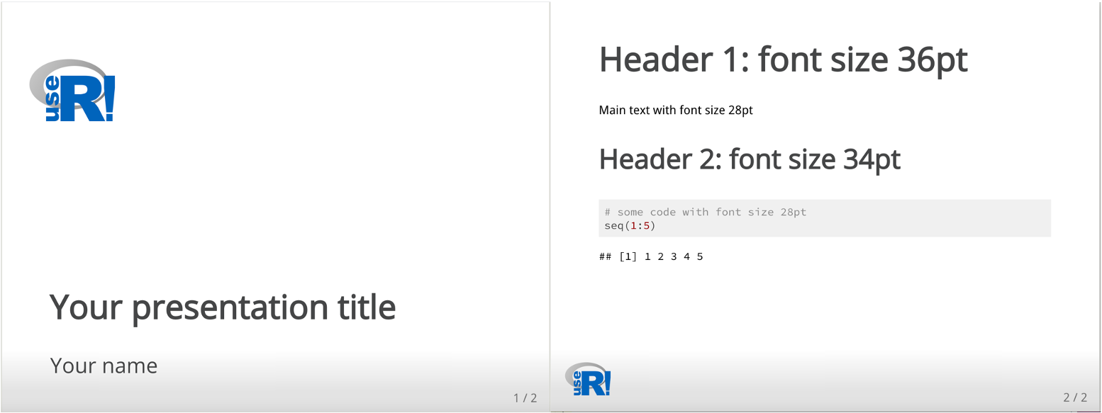
Make sure all materials have legible text with distinguishable font and font size, so people can follow the conference from a small screen. For example, use Arial or any Sans serif typeface, and at least a 28 point size. Also, resize images so they can be viewed even on a small screen.
During your talk, try to speak as clearly as possible and leave your mouth visible to allow people to read your lips if necessary.
Add captions to your video or provide a transcript of your talk so it’s accessible to people who are blind, deaf, hard-of-hearing, or have low-vision and may be using software such as screen readers. Captions are preferable to transcripts because they provide access to the visual and spoken content of the presentation at the same time, making it easier to understand. Be aware that automatic caption platforms could be inaccurate, so take the time to double-check captions are synchronized and the transcription corresponds with your content.
To help presenters follow our accessibility guidelines for presentations, useR! 2021 provides a template that covers all our technical accessibility considerations. A markdown template accompanied by a configuration .css file is a good starting point, please find our template here: useR2021 template.
If you want to go further, create a theme to use either with the xaringan or xaringanthemer packages. As an example, you can see our xaringan useR theme available for useR2021 and future conferences.
3. Create Accessible Figures
Add alternative text to your figures by briefly explaining what you are showing and why. Also, describe your images during the presentation, so that everyone can follow your content. If you are using alt text for the first time, you can find some recommendations here.
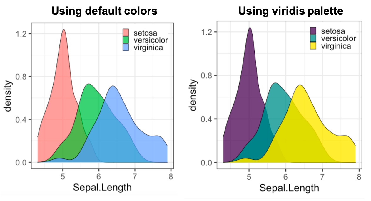
Consider that not all eyes see the same way, choose colors that more people can distinguish. If you are using ggplot2, the viridis color scale is a good choice. If you want to make sure your figures are colorblind friendly, you can use the colorblindr package to simulate what colors look like with various types of color blindness.
- If you need to use animated images or video clips, consider to follow the criterion SC 2.3.1 so people with photosensitive epilepsy as well as other photosensitive seizure disorders can view all of the material on your presentation without having a seizure.
4. Global Accessibility
Holding a global conference involves covering different time zones. Consider scheduling activities in multiple time zones so that everyone in the world can watch at least part of the conference live, and provide a link to all recorded sessions so people can catch up on what they missed.
Keep in mind that greatness comes in different languages. It is understandable to have an official universal language, usually English, but not all people have the same ability to speak it. Let people show their contributions in a language they feel comfortable with and provide captions for the rest of us. This alternative is even easier if you request pre-recorded talks.
If you have the capacity, offer financial support. The global situation of the pandemic has affected all of us but for some people it has been more difficult than for others. Scholarships can make a difference now more than ever.
5. Accessible Social Media
For online conferences in particular, a lot of the chatter around the conference happens on social media. This mostly informal exchange accounts for much of the fun part of a conference. Make sure to include all participants in the fun part, too.
Even though they look pretty, emojis are not the most accessible content, please limit their use and capitalize the words inside hashtags ex.
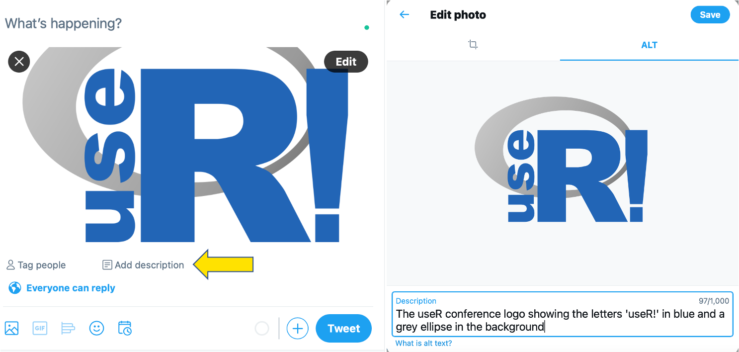
#WeAreUseRto make them easy to read.If you use static images or gifs, please include a short description in your post, for example, Twitter has an option to include alt text when posting an image. Alternatively, you can include the description of the image in response to the original post.
- If you are organizing a global conference, publication in multiple languages is appreciated. People may feel more welcome if you go the extra mile to invite them in their own language. We know this point could be difficult to achieve for many languages, so invite people to spread the word with some translations.
6. Accessibility ≠ Accessibility Standards
As we’ve seen, accessibility can be approached from many angles. We believe making available a list of accessibility standards could be a great guidance for both presenters and participants. See for example our guidance for tutorial instructors: Accessibility Standards for Tutorials.
Of course, no list or guideline can cover all use cases. Hence, please contact our accessibility team if you have questions or concerns or need support to improve accessibility of your presentation. user2021-accessibility [ at ]r-project.org.
Additional References
If you want to read more about accessibility, here is some additional material:
Enhancing the inclusivity and accessibility of your online calls
Contrast checker. Also check out Mohamed El Fodil Ihaddaden’s package savonliquide for an API in R.
How to Create Alternative Text for Images for Accessibility and SEO